CHALLENGE: The objective was to update the package design to become more contemporary, tasteful, easier to understand and compatible with the other Sugar Foods brands, while it would still resemble the old branding for consumer recognition and retention.
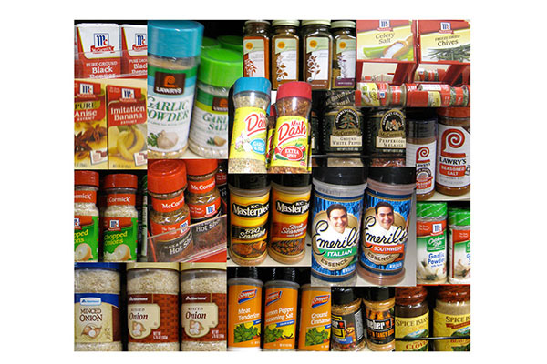
RESEARCH: The redesign process started with research of the shelf competition and contemporary design trends. The research revealed that less cluttered, ore simplified packages were more effective in clarity of message and tasteful consumer appeal. This process was also very helpful in understanding of the elements that would help create an outstanding package.
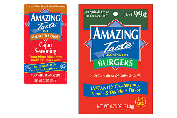
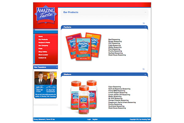
BRAND ANALYSIS: An in-depth look at the design of the labels and packets revealed that there were inconsistencies and redundancies in the designs. too much information was placed on the labels whereas usually packets bear more text and description. A complete reorganization of the content was necessary to create a sound design strategy.
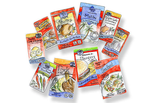
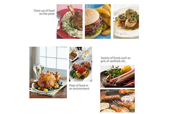
STRATEGY: Different approaches for packet designs would include adding the image of actual prepared
foods in a particular environment such as the dining table, the grill, etc. Depending on the information on
each packet, images would vary. For example, a multipurpose seasoning could present a variety of meat,
poultry an fish on the grill.
foods in a particular environment such as the dining table, the grill, etc. Depending on the information on
each packet, images would vary. For example, a multipurpose seasoning could present a variety of meat,
poultry an fish on the grill.
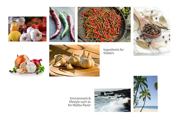
STRATEGY: Shaker labels would be more simplified and bold with images of actual ingredients rather than prepared food servings. There imagery could be presented in photographic or illustrative formats.
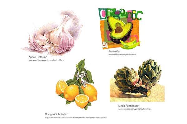
STRATEGY: Research and analysis of a variety of illustration styles and their impact on final consumer perceptions of product value and market segment appeal were considered.
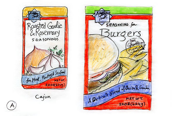
CREATIVE DIRECTION A: Design A is similar to the old package with some minor nuances that create a big impact. Colors have been modified to be brighter. Diamond shaped logo is small and moved to top left. Top color band that bleeds all around, determine flavor differences using tasteful colors. Blue ribbon is intact, although it does bleed to sides. Negative space on top of image helps create a more clean and simplified look. Black burst on the packet brings about a look of gourmet and quality.
CREATIVE DIRECTION B: Design B is avantgarde and liberated. Red color is in your face and so is the tasteful photography/illustration. Ribbon bleeds off the top and changes color to differentiate flavors. Logo is super simplified and tucked in the top left corner. Colors are more vibrant and lighter than original.
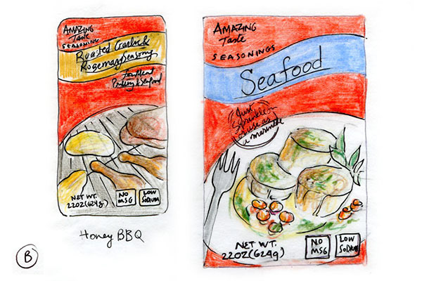
CREATIVE DIRECTION C: Design C is more true to the original packaging. The logo has retained Ribbon on the bottom, and there is an all around border. Brand flavors are differentiated through the color on top, gradiating into the imagery in the center of package. It would be good to keep the original "Optima" font and to also spice things up with some new fonts.
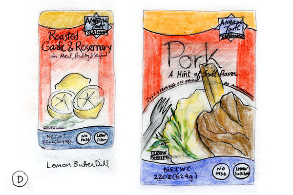
CREATIVE DIRECTION D: Design D has a minimalistic approach. The blue ribbon retains the same curves as the original, but is positioned to bleed and be cropped off the bottom. Small logo on top righthand side is positioned on a colorful curve that is bleeding to top distinguishing flavor differences. The gradient is center and the solid red border on sides with the food in your face reinforce the forward nature of this design approach.
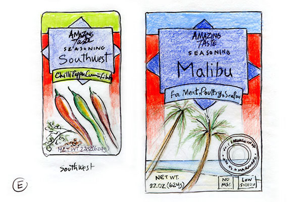
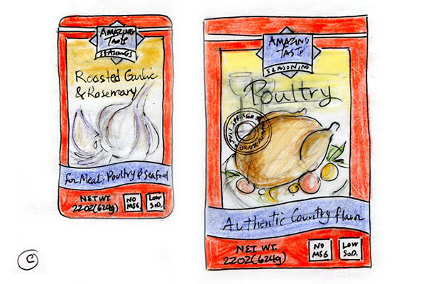
CREATIVE DIRECTION E: Design E retains the original logo shape, but logo text is placed on top in a small and simple way. The intention here, is to have maximum flavor differentiation and recognition of old elements, using a fresh and modern design approach. Use of white background on the bottom reinforces this idea. Of course some of the text will be reversed out in computer designs.