
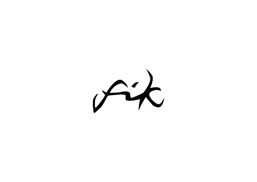
In Swedish the word “Fik” is a slang for “Café” and that is exactly what my Swedish student, Hanna Anderson, wanted to use for her café branding design. The design of this logo is inspired by the antlers of the Swedish moose, one of the most popular Swedish national icons.
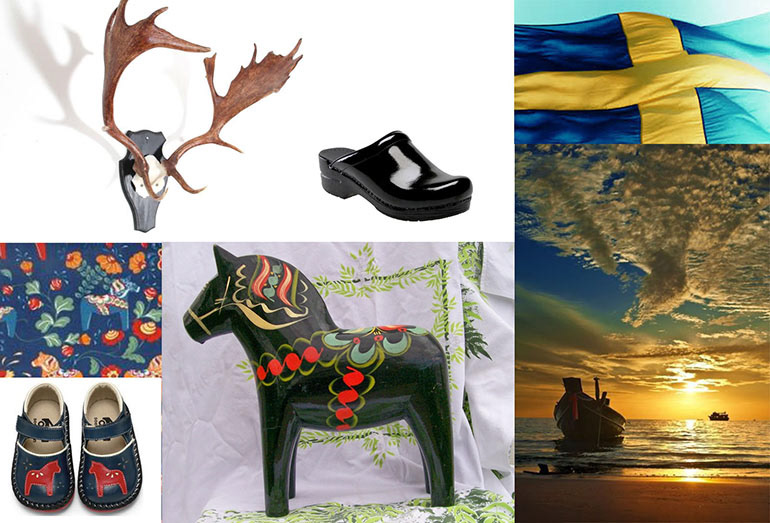
We explored various Swedish icons such as wooden horses, the sun that never sets, the yellow and cyan flag, clogs and moose antlers. In the design process it became clear that the moose would be the right fit as the main theme for logo and graphic elements.
Hanna designed the moose icon to create a pattern as background texture for her graphics.
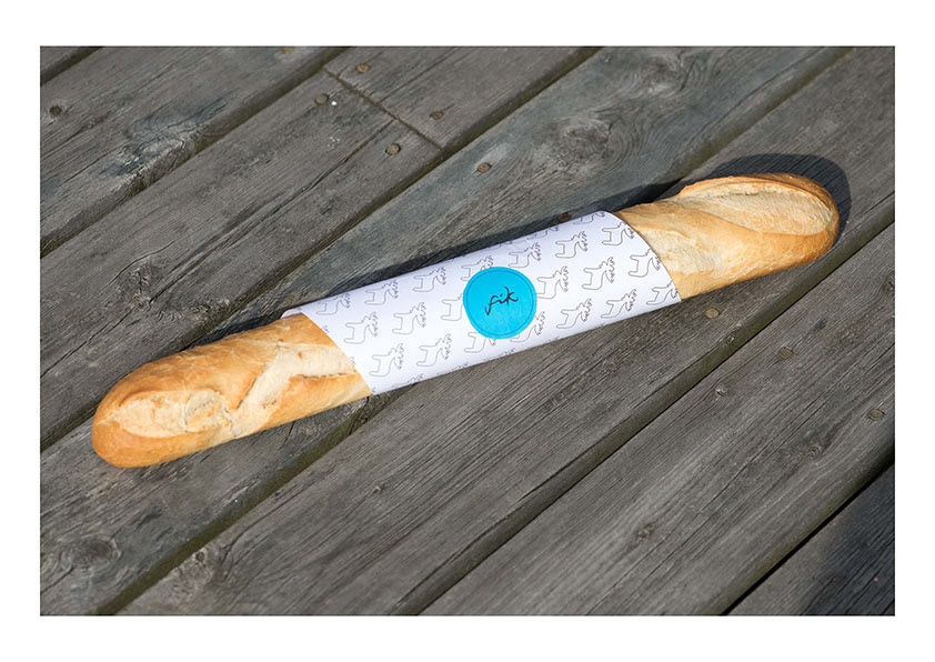
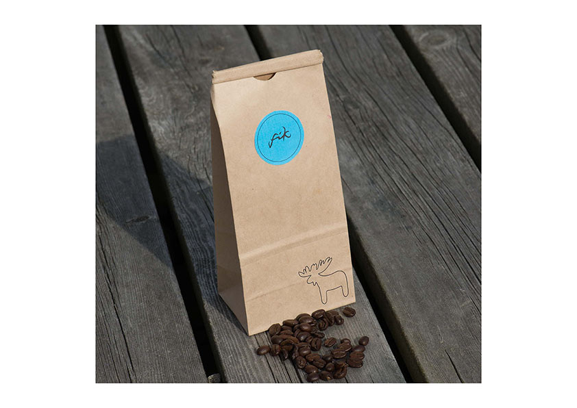
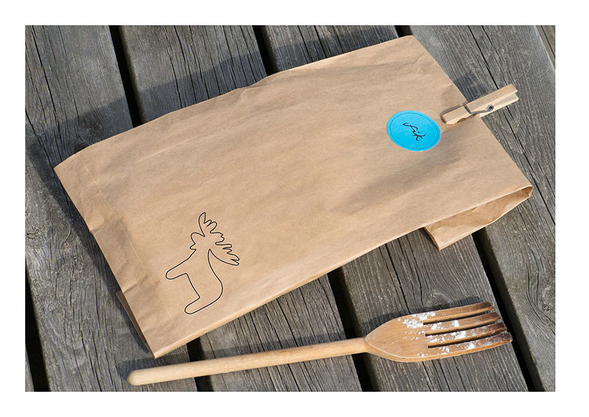
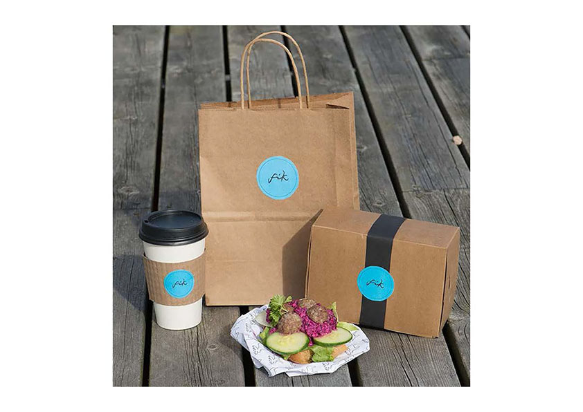
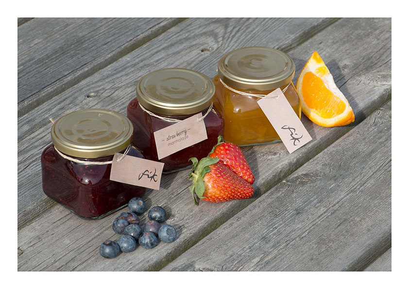
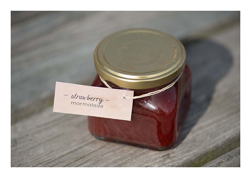
Hanna was envisioning a very simple café with a limited line of food and beverage products to serve a young and hip environmentally aware client base. All graphic materials were designed to be co-friendly. One color (black) ink was applied to all printed materials.

White and craft paper and blue stickers are the base for printing black logo, blue pattern and black text to create variety and visual interest to economically produced labels, stickers, hang tags, carryout bags, coffee cups and holders, and menu pages. Raffia and black ribbons are added to the mix.
The menu was designed by overprinting black sections of text on a large blue moose icon.
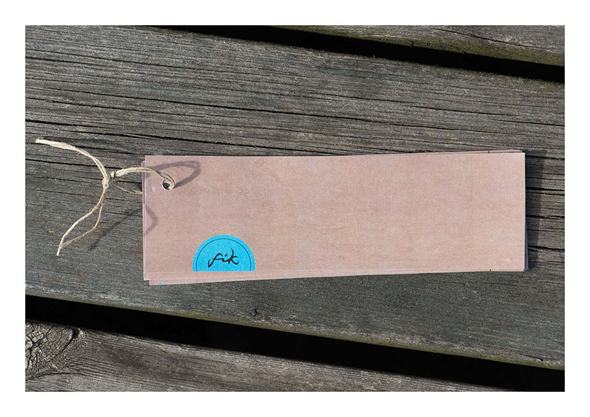
The large craft paper was then cut up to create a “fan” of user friendly and easy to navigate pages
that were held together on top with raffia.
The large craft paper was then cut up to create a “fan” of user friendly and easy to navigate pages
that were held together on top with raffia.